
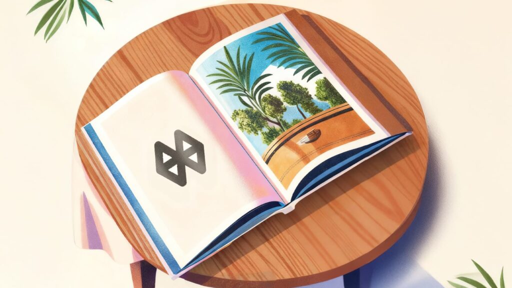
How do most people see a typical real estate brochure?
Pages filled with company information, aerial shots of the property, smiling faces strolling in landscaped gardens and glossy pictures of amenities. Right? Well, it’s not logically wrong—it’s just expected. Repeated so often, it has become a template for virtually every real estate project. Imagine if you receive a stack of brochures that look exactly like each other, engage like each other, promise like each other, you probably won’t feel compelled to even flip past the first two pages.
Now, let’s imagine something different. A brochure that tells a story, capturing the experiences that truly make a house feel like home. A home that feels yours. Builds desire. Sparks imagination. Shows a vivid future. Where every experience is hand- illustrated in a way that fills emotion, meaning and connectedness. Suddenly, that typical brochure isn’t just a collection of pages; it becomes an actual experience of a life that may be yours. Perhaps, a beginning called home.
Instead of showing luxury through standard stock imagery, it conveys what living that imagined life feels like—soothing, immersive, and personal. That’s exactly what we did for Terrace Tree. The result wasn’t just appreciated by the stakeholders; in fact, it went on to create something lasting—the timelessness of the brochure itself.
As a creative advertising agency, Monkey Wrench truly believes in stepping out of a standardised template. Among the many marketing tools businesses use, we see brochure design as an opportunity to stand out and not to look like “just another brochure.” We go beyond presenting information and features only. Every element—imagery, layout, typography, tone—is intentionally crafted to reflect the buyer’s perspective and the soul of the brand.
Here’s how we redefine brochure design service—not as a routine task, but as a purposeful and meaningful creative campaign.

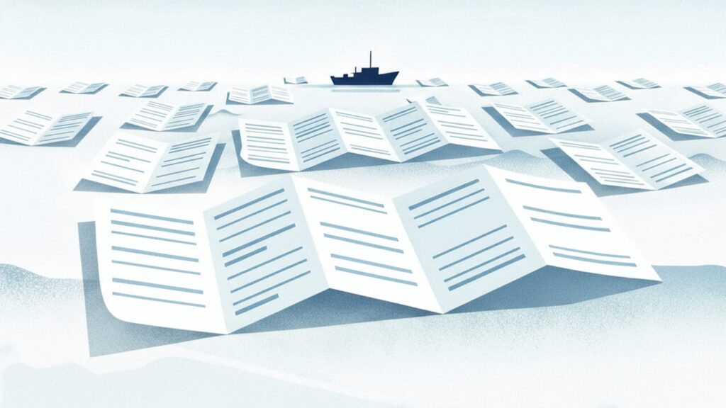
1. Beyond the sea of “informative boring brochures”
Let’s face it: many brochures are predictable. You see them at trade shows, offices, and lobby racks; similar layouts, similar headlines, the same bullet-point approach. They inform, sure but rarely ignite.
Monkey Wrench’s philosophy is to break that mold. We begin with deep discovery, pushing past the superficial “here’s what you do” to uncover the emotional core of what the company stands for. In a sea of static leaflets, we aim to deliver something that feels alive — that tells a story, speaks to identity, and compels next steps.
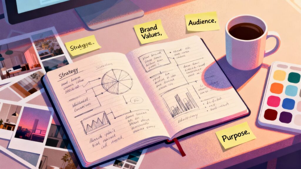
2. Our Process: Discovery first, design second
We don’t jump into layouts, templates, or stock visuals. Instead, our first step is:
- Company deep dive: We audit your brand history, mission, values, tone, market positioning, strengths and weaknesses.
- Zone of operation & purpose: What industry or niche are you in? What is your competitive space? Who are your buyers or stakeholders? What gaps or opportunities exist?
- Competitive analysis: We examine your competitors’ brochures, marketing assets, digital presence, and voice—benchmarking what’s standard, what’s tired, and where disruption can happen.
- Purpose of the brochure: Is this for lead generation, product launches, internal use, trade show handout, investor pitch, or brand awareness? That purpose becomes our anchor.
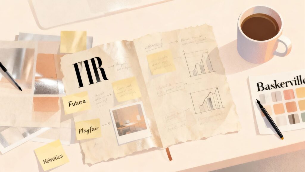
3. Innovation in typography, paper, and shape
Once the strategy is clear, design becomes storytelling through form and material.
Typography aligned with purpose
We select typefaces not just for looks, but for tone. A tech startup may use sleek, geometric sans-serifs. A luxury brand might lean on high-contrast serifs or custom lettering. We explore variable fonts, overlays, cutouts—whatever reflects your voice.
Paper and special finishes
Print still matters — and the tactile impression is powerful. We explore non-standard stocks (textured, uncoated, translucent, metallic) or finishes (spot UV, embossing, foil, die-cuts) that make the experience unforgettable. Want a lightweight, translucent vellum section that hints at something behind? A fold-out gate brochure? We prototype physical proofs so you see and feel the difference.
Shape & folding experiments
No default trifolds here. If your narrative needs sequential unfolding, we might use Z-folds, accordion structures, or even nonstandard shapes (die-cut shapes, curved edges, wraparound flaps). For instance, a brochure for a nature tourism brand might fold into a leaf shape or include pop-ups. The shape itself becomes part of the message. These innovations help your brochure stand out physically, inviting the recipient to pick it up, unfold it, explore it — rather than setting it aside.
4. Content alignment, storytelling, and design
A brochure should not feel like a static data sheet. We treat it as a mini storytelling journey: cover → hook → reveal → resolution → action.
- Compelling cover & headline: The first impression must intrigue. We test multiple headlines — provocative questions, bold promises, narrative cues — paired with striking visuals or treatments like cutouts, overlays etc. We explore multiple covers to find the one that arrests attention.
- Inside flap as the hook: The inside flap can be interestingly used to address a reader’s pain point imaginatively and build aspiration: “What if your supply chain never broke down again?” or “Imagine your brand felt as alive as your product.” This draws people deeper.
- Body content with narrative flow: We segment content into digestible “mini chapters” — problem → solution → proof → benefit → mechanics. We intersperse visuals (infographics, icons, custom illustrations) and keep copy tight and compelling.
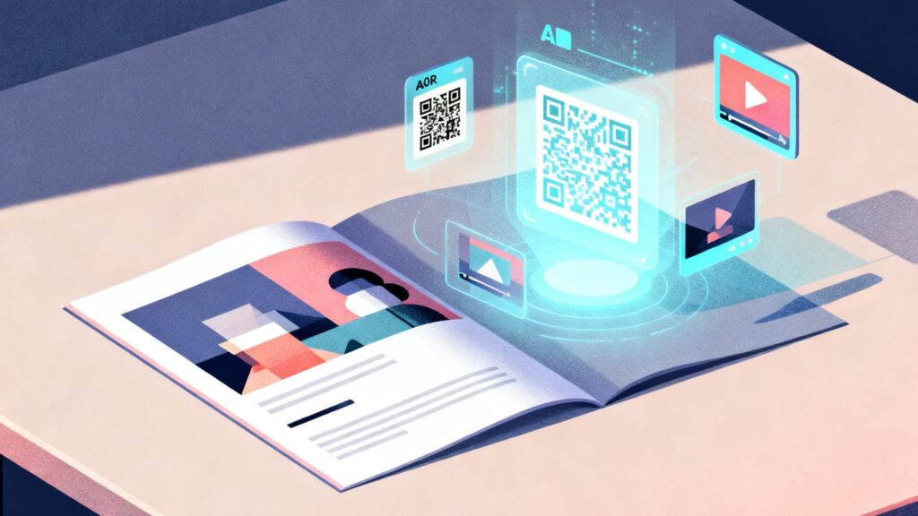
- Digital & interactive elements: Because we design with both print and digital in mind, we seamlessly incorporate QR codes, AR, interactive overlays, video triggers, or embedded microsites. For instance:
- QR linking to a video demo or virtual walkthrough
- AR popups: scan a section of the brochure to see a 3D model or animation
- Embedded forms or clickable CTAs in a digital version
- Product galleries, micro-animations or hover effects in digital flipbooks
- These elements help connect the real world to the digital world — making your brochure the opening act of a richer experience.
- Strong closing & CTA: We ensure the reader doesn’t leave dangling. The back or final panel offers a clear, persuasive call to action: schedule a demo, scan to redeem, subscribe, visit, or call; whatever fits your goal. We back this with contact info, map, or interactive links.
The most important thing,throughout, branding elements remain consistent — same logo treatment, color palette, typography, iconography for reinforcing identity and trust.
5. Versions and formats: print, digital, hybrid
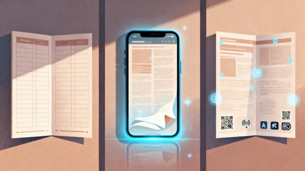
We don’t believe in “only print” or “only digital.” We deliver:
- High-resolution print masters — with bleed, crop marks, accurate colour profiles. We also deliver mockups.
- Digital flipbook or e-brochure — fully interactive versions that retain layout while layering click, video, AR, etc.
- Hybrid versions — a print brochure with AR triggers, QR codes, or NFC chips embedded to bridge physical to digital.
- Modular / scalable versions — for instance, a core brochure plus “add-on insert cards” or microsites to support multiple product lines without redesigning the whole.
By offering this flexibility, your collateral ecosystem becomes more versatile and future-proof.
Why Assign Monkey Wrench For Your Brochure Design?
To sum up what makes us the creative choice in brochure design:
- Strategic-first mindset: We never design in a vacuum; every decision is anchored in discovery and purpose.
- Narrative & emotional orientation: We seek not just to inform but to move, to connect.
- Material & format innovation: We experiment with paper, shape, finishes, interactivity, making the brochure itself part of your brand story.
- Digital fluency: We fluidly integrate QR, AR, flipbooks, and interactive modules without breaking the visual coherence.
- End-to-end packaging: We don’t throw a PDF over the wall — we guide usage, distribution, and analytics.
- Local + global sensibility: Based in Kolkata, Monkey Wrench blends cultural sensitivity with global standards in design and storytelling.
When you commission a brochure project with us, your professional brochure design becomes more than just a neatly folded piece of information. You gain a creative partner who uncovers the deeper layers of your brand story, reshapes how your audience connects with your message, and delivers an integrated, multi-format asset that truly drives engagement.