


Packaging Design Trends Guiding Kolkata’s Next-Gen Brands
Sep 16, 2025
“Design can be art. Design can be aesthetics. Design is so simple, that’s why it is so complicated.”
— Jim Henson, Iconic American Puppeteer and Founder of The Jim Henson Company
A green tube or a little white-green cream tub sitting on a Bengali dressing table. Do you really need to read the name? From across the room, you can tell it’s Boroline, a product that has quietly woven itself into Bengal’s cultural fabric. The same goes for the classic wrapper of a Bapuji cake in Kolkata. Unchanged for decades, it continues to hold its place in households as if time itself preserved it.
Some brands don’t need an introduction because their packaging has become their identity. It turns into an everyday fixture, a generational keepsake, and in many cases, a piece of heritage. Packaging is far more than a wrapper; it is the language through which a brand speaks, connects, and endures. It is the tangible expression of identity. Whether it is a global icon like KFC, Heinz, or Cadbury, or a fledgling startup fighting for attention on crowded retail shelves, packaging makes all the difference. An eye-catching pack might not guarantee a purchase, but it can spark curiosity, earn a consumer’s touch, and most importantly, gain mindshare.
The numbers prove this point. A Johns Byrne report highlights that 81% of consumers worldwide have tried a new product simply because its packaging caught their eye, while Globe Newswire notes that 72% of shoppers agree packaging design directly influences their purchase decisions. These figures prove that packaging can make or break a product’s journey, no matter the market.
In Kolkata, design often carries the city’s authentic cultural essence. The joy, nostalgia, and quirk of the “City of Joy” are reflected in the packaging of everyday products. But as we move into a more global arena, brands now face the challenge of blending this local identity with global design trends.
With that in mind, let’s explore the most impactful packaging design trends of 2025:
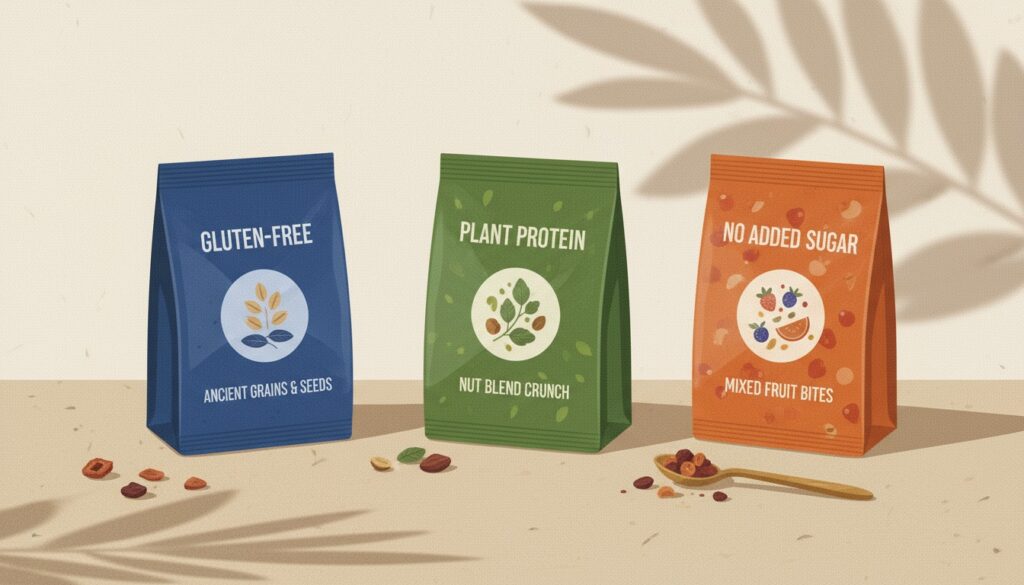
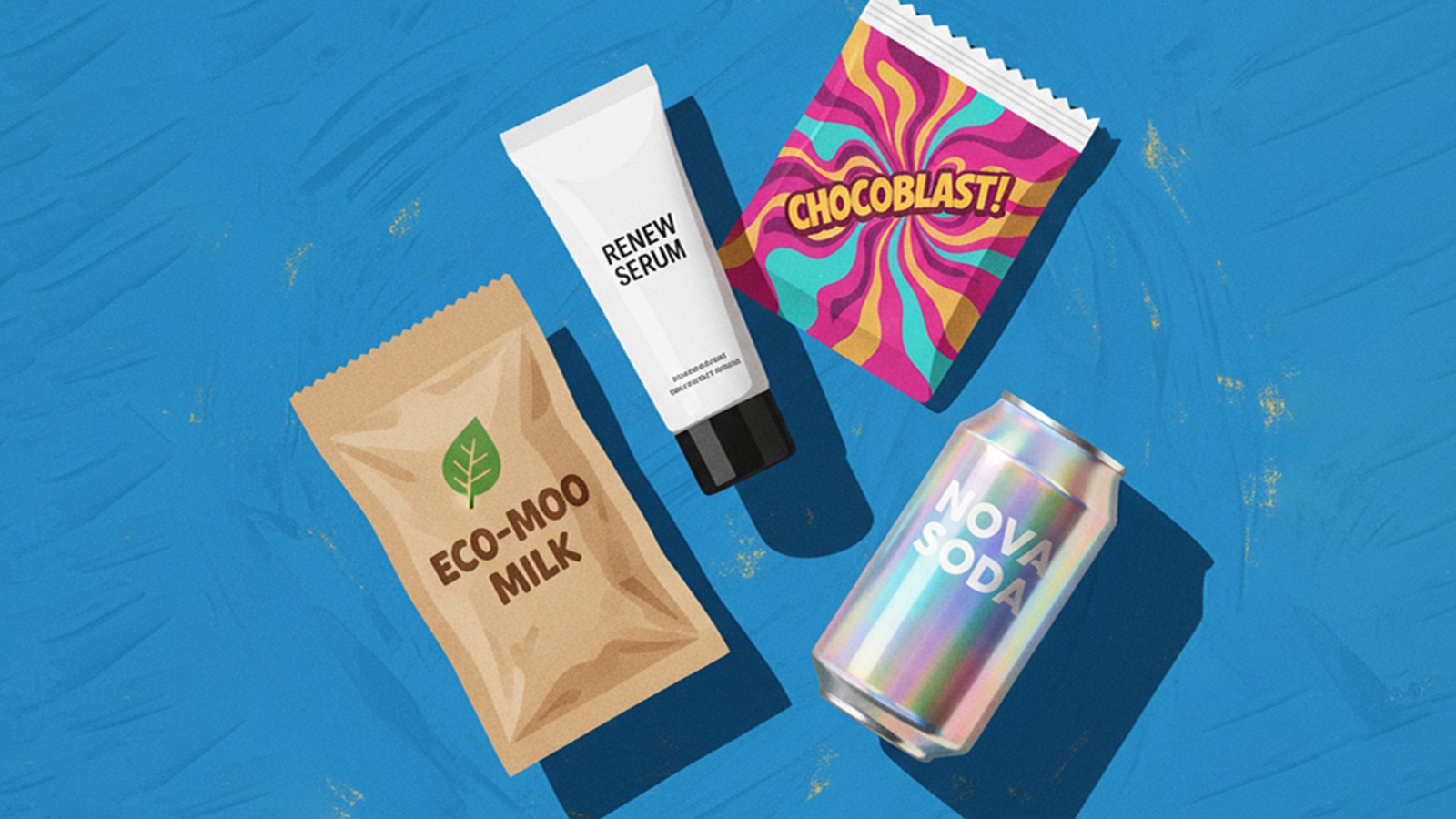
1. Neo-Minimalism with Bold Contrast
Minimalism has been around for decades, but 2025 brings a bolder twist. Neo-minimalism pares designs back to the essentials while adding sharp contrast—whether through color blocking, oversized typography, or stark negative space.
This aesthetic signals confidence and premium quality, aligning with research showing that simpler packaging increases the perception of higher value (Journal of Marketing, 2024).
Example: The Whole Truth Foods, a healthy snacks brand, reworked its packaging to highlight ingredients and health flags (“no added sugar,” “gluten-free”), using clean layouts, strong block colors, and minimal ornamentation. This allows consumers to instantly grasp the product’s transparency and health positioning.

2. Biophilic Geometry
Consumers crave nature amid urban chaos. Biophilic geometry reflects this desire by weaving in natural patterns—flowing lines, leafy motifs, earthy tones—that connect products with sustainability and calm.
Example: Forest Essentials, a luxury Ayurvedic brand, balances premium feel with natural inspiration. Amber glass jars, gold lids, and labels with subtle botanical illustrations evoke elegance while reinforcing the brand’s herbal roots. The earthy colors and delicate illustrations make nature a tangible part of the product experience.
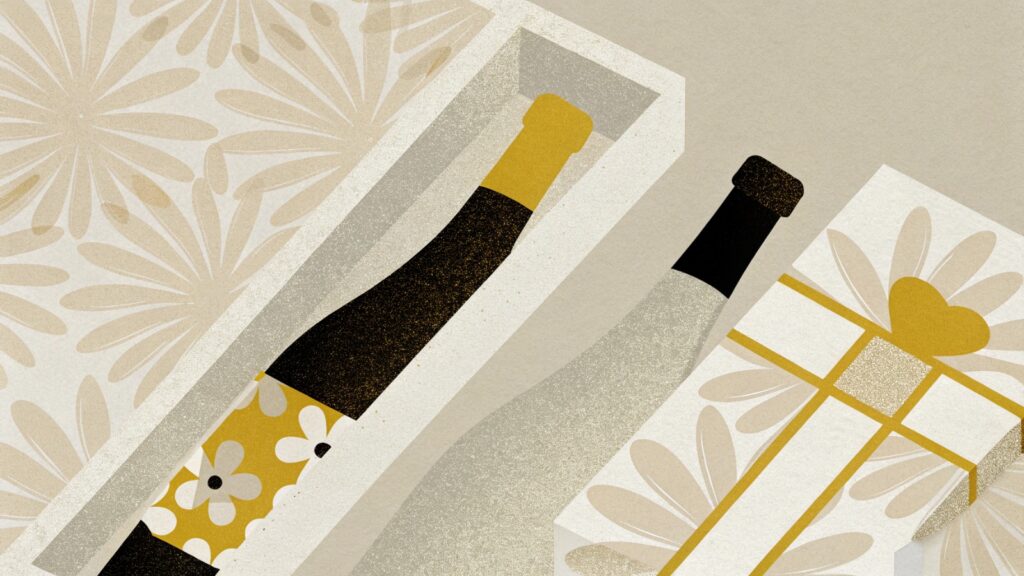
3. Tactile Interaction
Luxury is increasingly defined by touch. Embossing, debossing, soft-touch coatings, and textured materials transform packaging into a sensory experience. Gartner research shows that touch can increase perceived ownership of a product, making tactile packaging not only a design choice but also a sales strategy.
Examples: Perrier-Jouët adorns its champagne boxes with debossed floral motifs for a premium edge. Wener Skincare differentiates products by adding unique textures to bottles, ensuring each feels distinct. Soklet, India’s first tree-to-bar chocolate brand, uses rich textures, metallic foils, and silk-inspired patterns that elevate unboxing into a luxurious ritual.
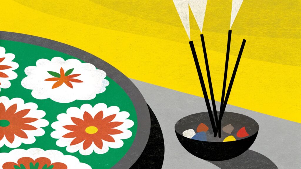
4. Vibrant Maximalism
Against a sea of simplicity, maximalism bursts forth. In 2025, brands are embracing bold, layered designs filled with color, pattern, and personality. This strategy is especially effective in categories like coffee and chocolate, where many competitors have gone minimalist.
Example: Phool, known for incense made from temple flowers, embraces vibrant maximalist visuals with bold colors and cultural motifs, communicating joy, tradition, and eco-positivity in one frame.
5. Retro-Futurism
Gen Z’s love of nostalgia collides with their digital-first lifestyle in the rise of retro-futurism. This style blends vintage typography, pixel art, and psychedelic colorways with futuristic finishes like holographic foils and AR integrations. By combining past and future, retro-futurism appeals both emotionally and visually—while driving engagement through tech-enhanced packaging.
Examples: Coca-Cola’s “Zero Sugar Byte” launched with pixelated fonts reminiscent of 90s gaming and was sold almost exclusively online. Goshen Coffee captures attention with disco-inspired reflective boxes that customers often keep long after finishing the product.
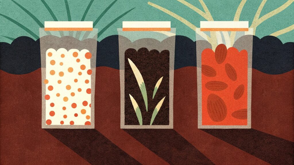
6. Eco-Visibility
Eco-friendly is no longer hidden in the fine print. Brands are making sustainability visible through earthy tones, uncoated textures, and bold claims on pack. With over 60% of Gen Z willing to pay more for sustainable packaging, eco-visibility is both a moral choice and a marketing advantage (Nielsen, 2024).
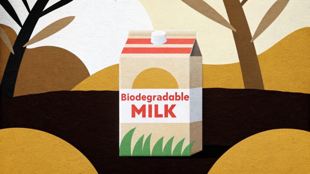
Example: A brand launched biodegradable milk packets made from corn starch, sugarcane, and plant-based materials that decompose within 90 days. The textures and colors proudly signal biodegradability, instantly conveying eco-values.
7. Creative Cutouts
Die-cut windows and transparent layers invite curiosity while showcasing product authenticity. They blend artistry with trust by letting the product itself be part of the design.
Examples: Good Hair Day Pasta uses cutouts shaped like hair strands and faces, where the pasta itself completes the illustration—a playful storytelling device. Oatly fills its cartons with witty, scribbled slogans that connect with consumers on a human level.
8. Hand-Drawn Aesthetics
Imperfect lines, doodles, and handwritten fonts bring warmth and humanity to packaging in an AI-dominated world. They make brands feel approachable and real.
Example: Goenchi Feni’s label features hand-drawn illustrations of local people (Rendeirs, Cazcars), traditional glass carboys, and scenes from the feni-making process, evoking heritage and craftsmanship.
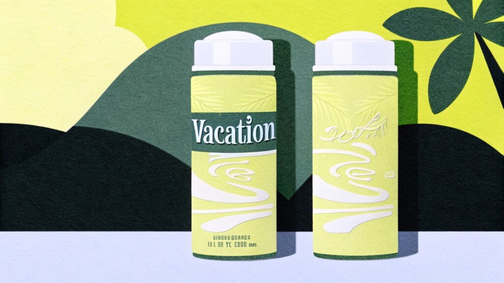
9. Chaos Packaging
Breaking category rules, chaos packaging uses unexpected forms and wild juxtapositions to spark curiosity. It thrives in the age of Instagram and TikTok, where shareability equals brand equity.
Examples: Vacation’s sunscreen mousse packaged in whipped-cream cans and Fishwife’s sardine-shaped chocolates sold in authentic fish tins. Both went viral, sparking massive social media buzz.
10. Localized Imagery
Humans are wired to respond to imagery, and over 60% of buyers say visuals influence their decision (Nielsen, 2024). In packaging, localized imagery—street scenes, cultural motifs, regional architecture—creates instant relatability.
Examples: Nukkad Printer in Kolkata created visiting card boxes shaped like the city’s metro, minibuses, and local trains, turning ordinary cards into distinctive, culturally inspired designs. Jaipur Dairy incorporates Rajasthani palace silhouettes and craft patterns into its packaging, resonating more strongly with local pride than generic landmarks like the Taj Mahal ever could.
11. Smart Packaging
Beyond aesthetics, smart packaging introduces technology for safety, authenticity, and engagement. Active packaging extends shelf life with compounds that protect contents, while intelligent packaging communicates freshness, contamination, or usage details via sensors, QR codes, or AR layers.
This builds trust, reduces waste, and enhances logistics. With India’s growing pharma and food sectors, the adoption of smart packaging is accelerating.
Example: Lay’s “Mitti Ki Chitthi” campaign featured hand-drawn portraits of potato farmers alongside QR codes linking to a film about the bond between soil, farmers, and the land.
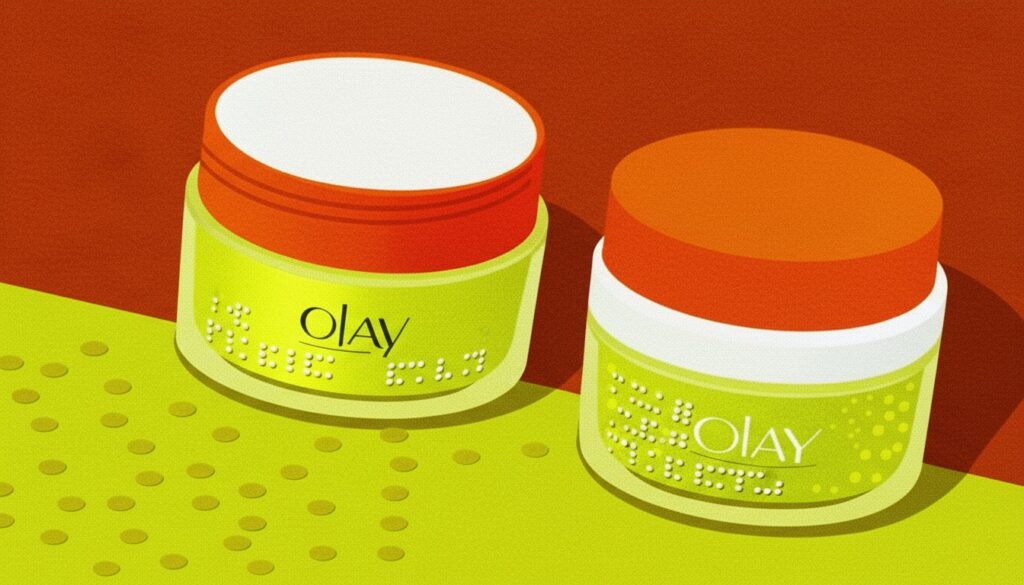
12. Inclusive Packaging
Inclusivity is no longer optional—it’s a marker of modern brand responsibility. Packaging that considers differently-abled consumers, diverse cultures, and gender neutrality broadens accessibility and strengthens emotional connection.
Example: Olay introduced tactile cream jars with Braille for the visually impaired, ensuring skincare is accessible without dependency and reinforcing the brand’s equity in empowerment.
Packaging: The Canvas of Innovation
Packaging is storytelling on a small canvas. It is where colour, font, material, technology, and creativity come together to narrate a brand’s journey. At its core, packaging is about innovation that feels familiar—something that resonates with people while surprising them with fresh ideas.
Even after more than 25 years in the packaging design landscape of Kolkata, we continue to approach every project, keeping in mind, context, culture and people. From shaping established brands like Linc Pens to nurturing rising players like Total Chicken, Doreme and more, our journey has always been about building stories that live beyond the shelf.
Trends will evolve, but what truly lasts is a design that captures identity, emotion, and trust. That’s why when we speak of packaging design trends in Kolkata, we don’t just follow what is current. We aim to craft designs that are efficient, transparent and are able to connect with people in meaningful ways and yes, beyond nostalgia.
If you are ready to create packaging that is not just trendy or ‘buzzy’ but timeless, let’s take on this journey together. Your story deserves a canvas worth remembering.
Next Story
Professional Brochure Design and Its Relevance in the Age of Screens
Sep 22, 2025
“Design can be art. Design can be aesthetics. Design is so simple, that’s why it is so complicated.”— Jim Henson, Iconic American Puppeteer and Founder of The Jim Henson Company…
Read More