


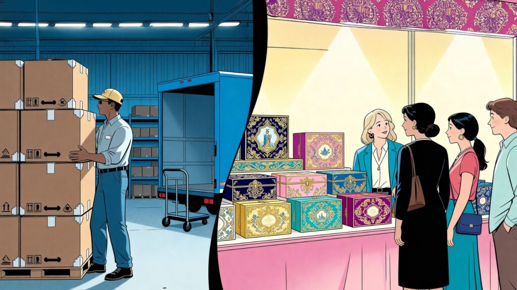
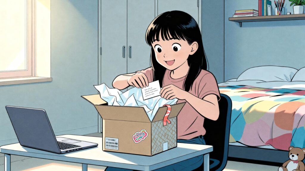
Creative Packaging Cuts and Structures That Make Products Stand Out
Dec 8, 2025
To understand how packaging earns its place in memory, it is worth beginning with an industry that perfected the art long before the term branding existed: the world of spirits. Since the earliest days of wine and spirits, bottle shapes have been guided by utility long before aesthetics. Wine bottles adopted broad bases and long necks to trap sediment. Whisky and brandy travelled in stout, sturdy forms built to survive rough sea voyages. Over time, these practical shapes became unmistakable brand signatures.
Designs kept evolving with culture and craft. Absolut’s famous 1979 bottle borrowed its look from an old Swedish medicine flask, proving simplicity could feel luxurious. Patron took inspiration from traditional Mexican glassmaking, blending heritage with modern appeal.
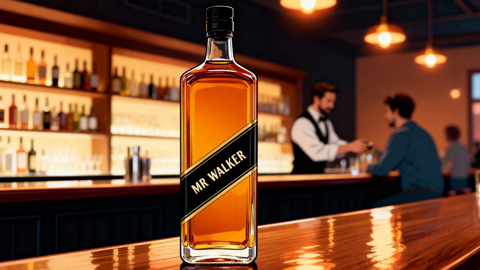
Amid these innovations, one of the smartest structural moves came from Johnnie Walker. Long before it became iconic, the square bottle was simply a shipping solution that reduced breakage and fit neatly into crates. But the diagonal label changed everything. That subtle tilt introduced visual friction — just enough asymmetry to make the eye pause, notice, and remember.
This story captures something fundamental about packaging: every outstanding design is shaped by two core forces: utility and aesthetics.
When these two meet meaningfully, the result is timeless.
Utility vs Aesthetics: Two Sides of Packaging Architecture
All packaging sits on a spectrum between functional engineering and emotional beauty.
Utility-based packaging prioritises:
- Protection
- Structure and durability
- Ease of stacking and storage
- Ergonomics for handling and opening
- Cost efficiency (transportation, volume, material usage)
These are the “invisible” reasons we trust a package without thinking.
Aesthetics-based packaging focuses on:
- Visual seduction
- Brand symbolism
- Emotional storytelling
- Shelf differentiation
- Cultural or artistic references
These are the “felt” reasons we fall in love with a product.
The art of creative packaging lies in balancing both. A gorgeous box that fails to protect is forgettable; a sturdy box that looks uninspired is invisible.
The Anatomy of a Product Package
Packaging isn’t a box. It’s a multi-layered experience. Each layer meets a different need.
- Material
Paperboard, corrugated sheets, rigid boards, plastics, or hybrid structures. Material decides strength, sustainability, finish, and perceived quality. - Structure and Cut
Folds, locks, windows, die-cuts, curves, and closures. This is the architecture, the part consumers feel first. - Graphics and Surface
Typography, colours, illustrations, embossing, foiling, patterns, imagery. This is what tells the brand’s story. - Ergonomics
Ease of carrying, opening, dispensing, and resealing. This is the interface between user and product. - Unboxing Experience
Layers of reveal, the sound of opening, textures inside, and printed messages. This is where emotion peaks.
Understanding this anatomy helps brands design with intention, not decoration.
Five Classic Packaging Icons and the Structural Genius Behind Them
Some packages have become global symbols not because of graphics alone but because of their structural intelligence.
1. The McDonald’s Happy Meal Box
Why it stands out:
A simple gable-top carton with a built-in handle. The hero element is its architecture—part lunch box, part toy chest.
Structural brilliance:
- The cut creates a house-like shape, instantly friendly for children.
- The built-in handle makes it portable and interactive.
- Flat surfaces allow designers to change graphics for campaigns, seasons, or licensed characters.
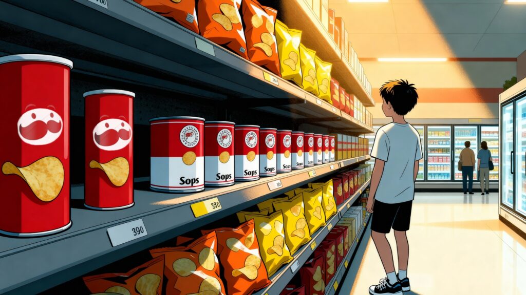
2. Campbell’s Soup Can
Why it stands out:
A cylindrical metal can with clean, uninterrupted vertical symmetry.
Structural brilliance:
- A 360° wrap label creates continuous visibility on shelves.
- The round shape is stackable and durable for long-term storage.
- The can itself becomes part of the ritual: open, heat, serve.
Andy Warhol turned it into pop culture, proving structure + minimalism can create icons.
3. Tiffany & Co. Blue Box
Why it stands out:
A rigid, perfectly proportioned box that elevates gifting into theatre.
Structural brilliance:
- A rigid board gives the sense of permanence.
- Lid and base friction are engineered for a soft “whoosh”, amplifying anticipation.
- The compact cube shape makes the box reusable—becoming timeless without trying.
4. The Pringles Canister
Why it stands out:
A composite tube that protects fragile stacked chips.
Structural brilliance:
- Vertical stacking eliminates product breakage.
- The cylindrical shape distributes pressure evenly.
- Slim diameter maximises shelf visibility while reducing wasted air space.
5. Toblerone Triangular Prism
Why it stands out:
The chocolate bar and packaging share the same iconic triangular geometry.
Structural brilliance:
- The prism-shaped box maximises rigidity with minimal material.
- Easy to stack horizontally or vertically.
- The long, slim shape creates a striking retail presence without additional decoration.
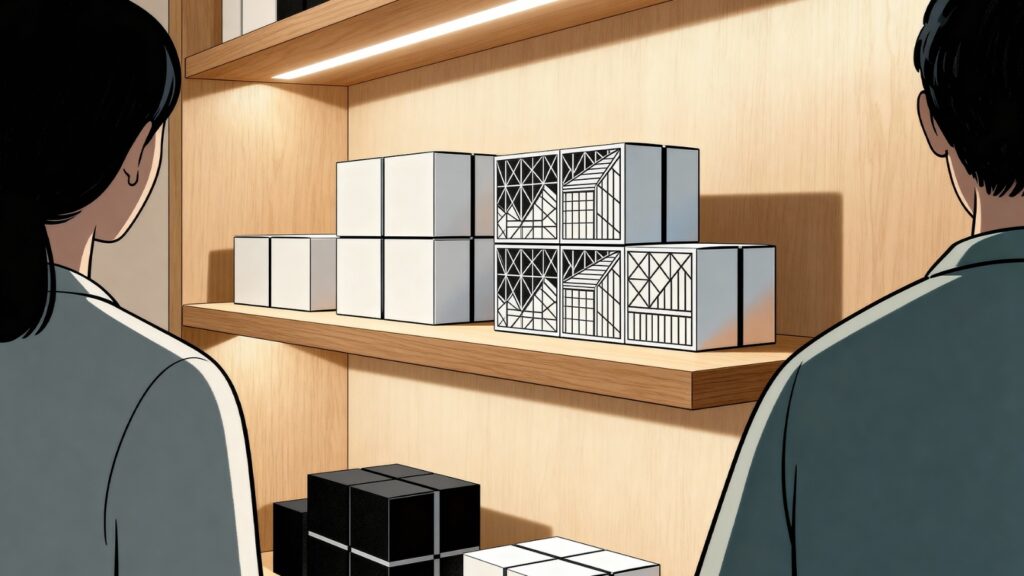
From Classics to Contemporary: Rise of Die-Cut Packaging
Die-cut technology has opened up the era of creativity without compromising function. A die-cut box is made by pressing corrugated sheets with a metal “die” to achieve precise, customised shapes—windows, curves, layered folds, or intricate closures.
Why die-cut structures became popular:
- Flexibility & Fit
Brands can tailor the structure to match product dimensions perfectly, reducing movement and damage. This also minimises cushioning waste, making it cost-efficient. - Visual Creativity
Windows, patterns, layered flaps, or shaped cut-outs add storytelling without extra materials. A strategically placed peek-through enhances curiosity. - Lightweight Efficiency
Die-cut forms reduce transportation weight, which cuts logistics costs—critical in India’s competitive retail landscape. - Enhanced Protection
Custom compartments and snug fits protect fragile products during shipping, a crucial factor for beauty, tech, and gourmet brands. - Endless Customisation
Shapes, handles, internal locks, or multi-layer reveals enable a premium unboxing experience.
Modern-Day Shapes and Trends: Where Creativity is Heading
- Minimalistic Structures
Inspired by Scandinavian and Japanese philosophies, these use clean cuts, simple folds, and restrained graphics. Apple’s two-piece rigid box is the benchmark here—structural purity + emotional clarity. - Pattern-Based Architecture
Instead of relying heavily on graphics, the box itself incorporates repeating shapes or perforations, turning structure into visual rhythm. - Cultural Geometry
Brands use regional patterns, folk-inspired motifs, and festival-driven cuts to appeal to specific audiences. This is especially powerful in India’s cultural micro-markets. - Multi-Surface Visual Continuity
A design element flowing across multiple surfaces creates motion and curiosity. This is a rising favourite in grooming, fragrance, and D2C brands. - Eco-Engineered Forms
New-age cuts minimise glue, favour interlocking systems, and use mono-material construction for recyclability. Corrugated mailers with dual adhesive strips support return logistics in e-commerce. - Experience-Led Shapes
Brands are designing for how the box opens. Think magnetic closures, sliding drawers, layered reveals, or sculpted openings. The goal is to make unboxing a shareable moment.
The Future Lies at the Intersection of Art and Engineering
If a bottle or package dazzles on the outside but fails in utility, it will not be remembered for the right reasons. As a packaging design agency in Kolkata, we begin with function, then let the story unfold through form, texture, and detail. That is how a brand becomes a storyteller you can touch, hold, and feel.
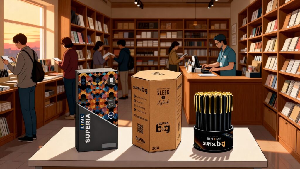
For stationery brands like Linc or Supra, every product we create carries its own narrative, sometimes through the shape of a pen’s barrel, sometimes through the shimmer of a foil detail.
This combination of structural thinking and creative storytelling is what makes a product truly stand out. If you want your story to take a physical form that is remembered, cherished, and passed on, let us begin this power-packed journey together.
Next Story
Visual Storytelling: The Role of Design in Building Strong Brand Identities
Dec 24, 2025
To understand how packaging earns its place in memory, it is worth beginning with an industry that perfected the art long before the term branding existed: the world of spirits.…
Read More