


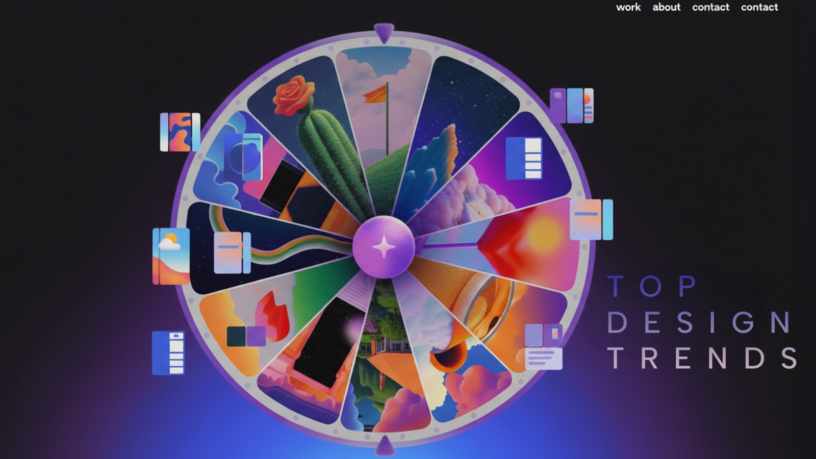
Top Web Design Trends to Watch in 2026
Jan 5, 2026
The very first website went live quietly in 1990. No colours. No images. No animations. Just black text, blue links and instructions on how to build more pages. Sir Tim Berners-Lee created it at CERN not to sell anything, but to explain an idea. The World Wide Web itself.
Fast forward to 2026 and it is almost funny to think about how far we have travelled.
Websites have survived every digital wave thrown at them. Social media booms. App fatigue. AI assistants. Voice search. Short-form video. Through it all, the website has remained the most reliable digital asset a brand can own. It is still where trust is built, stories are told and decisions are made.
What has changed is not the importance of the website, but its language.
Over the years, websites have evolved from static information boards into living experiences. Structure became smarter. White space became important. Content became fun to read instead of just being informational. Design began responding not just to screens, but to behaviour, emotion and consumer’s intent. Each generation left its fingerprints on the web, from early clutter and experimentation to minimalism, and now to something more human, expressive and intelligent.
In 2026, websites are no longer designed just to look good — they’re designed to feel right. At Monkey Wrench, a web design agency based in Kolkata, we believe it’s our responsibility to stay closely connected to how the global web is evolving and translate those shifts into meaningful, strategic design decisions for brands.
This guide explores the website design trends shaping 2026, how they’re being applied in real-world projects across the globe, and what they mean for brands ready to move beyond a basic online presence toward truly memorable digital experiences.
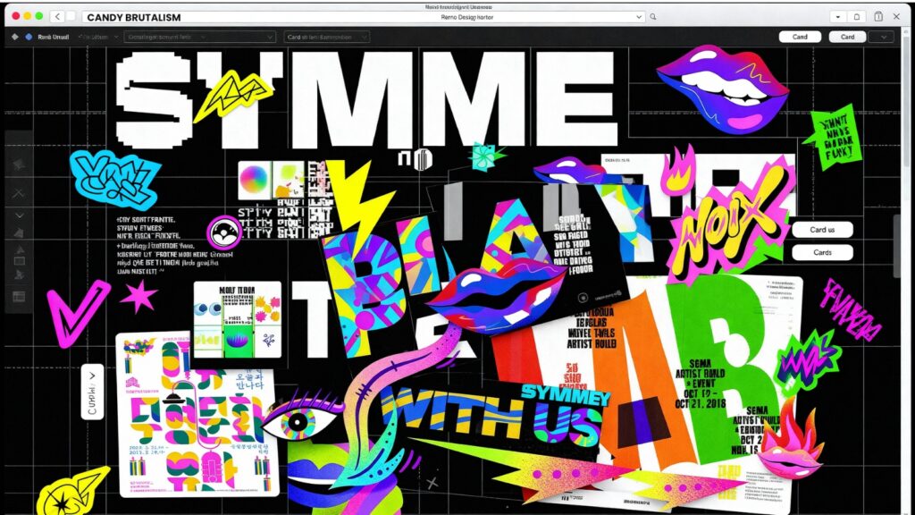
1. Candy Brutalism
What it is
Candy Brutalism blends two opposing design philosophies. The rigid, no-nonsense structure of brutalist web design is paired with playful, colourful, and almost childlike visuals. Hard grids, stark typography, and raw layouts are softened using stickers, doodles, bright colours, and cheerful iconography. For example, MSCHF uses raw HTML aesthetics mixed with playful chaos to provoke attention and interaction.
Why it matters
At a time when users are tired of perfectly polished templates, contrast creates memorability. Candy Brutalism stands out because it feels expressive and unexpected while still remaining functional at its core. It allows brands to show personality without compromising usability.
How it shows up
- Blocky layouts and asymmetrical grids
- System or mono fonts paired with rounded, playful visuals
- Bright colours layered over raw structural elements
- Intentional imperfections and visual clutter
2. Post-Internet Static
What it is
Post-Internet Static reinterprets early internet aesthetics for a modern audience. Instead of clean and minimal interfaces, this trend embraces visual noise through layered imagery, gritty textures, clashing fonts, and chaotic compositions. In India, independent music labels and streetwear brands use chaotic layouts to signal counter-culture. Balenciaga’s digital campaigns intentionally reject clean design conventions.
Why it matters
As digital spaces become increasingly sanitised, rebellion becomes attractive. This trend taps into cultural memory and nostalgia while giving Gen Z a darker, more expressive visual language.
How it shows up
- Overlapping visuals and layered text
- Y2K-inspired fonts mixed with gothic or grunge styles
- Metallic gradients, glitch effects, and rough textures
- Deliberately busy and high-energy layouts
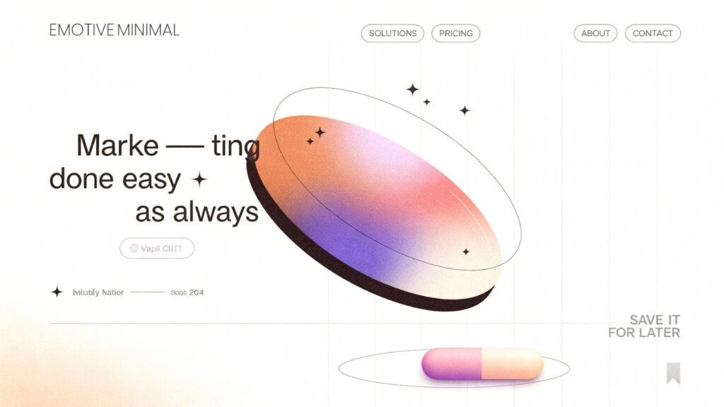
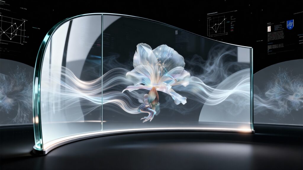
3. Emotive Minimal
What it is
Emotive Minimal strips websites down to their essentials while layering in subtle emotional cues. It is minimalism that focuses on feeling as much as function, using space, motion, and typography with intention. CRED uses restrained layouts and subtle motion to make finance feel aspirational. Apple’s product pages balance minimal design with emotional storytelling.
Why it matters
Users are overwhelmed by information. Emotive Minimal creates clarity without feeling cold, helping brands communicate calm confidence in a noisy digital environment.
How it shows up
- Generous white space
- Ultra-thin or refined typography
- Soft gradients instead of flat colour blocks
- Micro-interactions that add movement without clutter
4. Low-Energy Design
What it is
Low-Energy Design prioritises performance, sustainability, and accessibility. Visual choices are made with consideration for load times, battery usage, and environmental impact. Sustainable tech platforms prioritise performance-first design principles.
Why it matters
Sustainability is no longer just a brand message. It is becoming a design responsibility. Lightweight websites load faster, consume less energy, and perform better across devices.
How it shows up
- Optimised images and minimal scripts
- System fonts instead of heavy custom fonts
- Dark mode and energy-efficient colour palettes
- Simple layouts that reduce processing demand
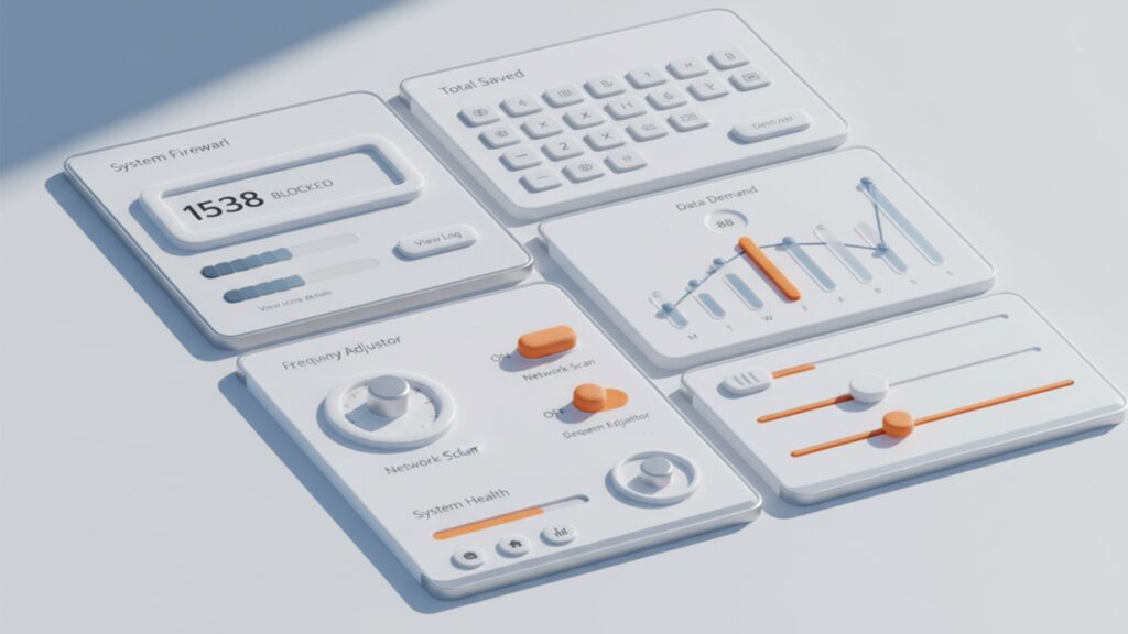
5. Tactile UI Revival
What it is
Tactile UI Revival brings back a sense of physicality to digital design. Interface elements look pressable and touch-responsive without heavy realism or excessive texture. Here, Swiggy’s interface uses depth to guide user actions intuitively. Shopify checkout flows use subtle tactility to build trust.
Why it matters
Clear affordances improve usability. When buttons feel clickable, users interact with more confidence, reducing friction and improving conversion.
How it shows up
- Soft shadows and gentle elevation
- Subtle gradients suggesting surface depth
- Lightly embossed buttons and cards
- Visual feedback on hover and interaction
6. Adaptive by Default
What it is
Adaptive by Default refers to websites that adjust content, layout, and messaging based on user behaviour in real time. Instead of static pages, experiences evolve for each visitor. For example, Amazon India adapts homepage sections based on browsing and purchase history.
Why it matters
Users expect relevance. Adaptive design improves engagement by showing people what matters to them at the right moment.
How it shows up
- Dynamic content blocks
- Behaviour-based recommendations
- Layouts that shift based on user intent
- Personalised calls to action and messaging
7. WebGL for Everyone
What it is
WebGL has moved from specialist territory into everyday web design. In 2026, designers no longer need deep coding knowledge to create rich motion, shader effects, or interactive depth. No-code and low-code tools now make advanced visuals accessible through visual editors rather than complex mathematics. New-age edtech and SaaS landing pages increasingly use lightweight WebGL effects to signal innovation while staying performant.
Why it matters
According to Gartner, no-code adoption is expected to grow by 65 percent by 2027. This shift removes technical barriers and puts creative decision-making back in the hands of designers. High-end motion is no longer about who can code it, but who knows when to use it and when to hold back.
How it shows up
- Subtle liquid distortions guiding focus
- Interactive backgrounds that respond to cursor movement
- Soft particle systems used for mood rather than spectacle
- Motion that enhances hierarchy instead of overpowering content
8. Magic of Hands
What it is
Magic of Hands celebrates visible human input in design. Scribbles, doodles, handwritten typography, and imperfect lines add warmth and personality to digital spaces. Oatly’s rough typography reinforces honesty and brand personality.
Why it matters
In an AI-driven landscape, imperfection becomes a trust signal. It reassures users that a brand is human, intentional, and authentic.
How it shows up
- Hand-drawn illustrations
- Script and handwritten fonts
- Sketch overlays on photography
- Imperfect alignment and texture
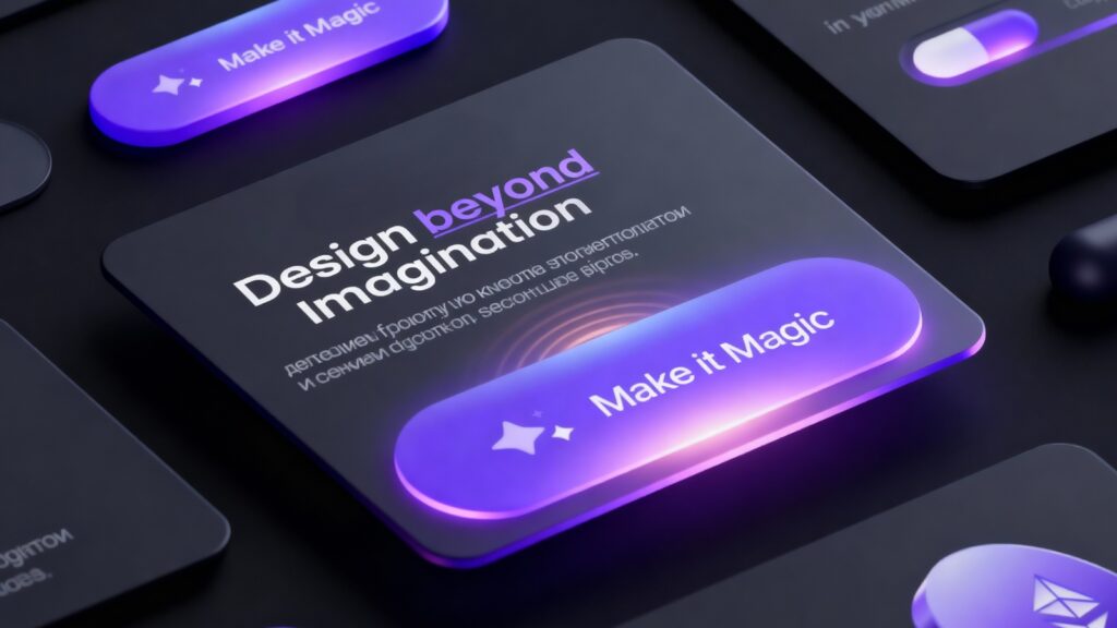
9. Light Skeuomorphism
What it is
Light Skeuomorphism brings back real-world references in digital design, but with restraint. Instead of heavy textures and overt realism, this approach uses subtle shadows, gentle gradients, and soft surfaces to suggest depth and tactility. It takes inspiration from early Apple interface design and refines it with brighter colours and lighter 3D realism. Boutique bakery and food brands use dough-like button effects to enhance warmth and tactility. In the same format, Apple’s current UI language reflects this softer, more refined skeuomorphic approach.
Why it matters
Flat design made interfaces visually clean but often removed cues that helped users understand what was interactive. Light Skeuomorphism restores those cues without feeling dated, making interfaces more intuitive and emotionally engaging.
How it shows up
- Lightly embossed buttons and cards
- Soft shadows that imply elevation
- Delicate gradients instead of flat fills
- Surfaces that appear touchable but not heavy
10. The Human Layer
What it is
The Human Layer refers to interfaces that respond to presence, movement, voice, and gesture. Interaction moves beyond clicks and taps toward more instinctive responses. Experimental platforms in education and accessibility are beginning to explore gesture- and voice-led interaction models.
Why it matters
McKinsey predicts that multimodal interfaces will define digital interaction by the end of the decade. This shift makes digital experiences feel less mechanical and more natural.
How it shows up
- Gesture-based interactions
- Voice-responsive interfaces
- Camera-driven presence detection
- Interfaces adapting to user behaviour in real time

11. Modular Brand Systems
What it is
Modular Brand Systems use flexible design components that can be rearranged across pages without losing brand identity. Instead of fixed layouts, brands rely on adaptable building blocks. As a best example, Google’s design language demonstrates the power of modular consistency.
Why it matters
Brands now operate across websites, apps, and platforms. Modular systems ensure consistency while allowing speed, scalability, and experimentation.
How it shows up
Reusable content blocks
Consistent spacing and typography rules
Flexible grids that adapt to content type
Design systems that scale across platforms
12. From UX to MX
What it is
Websites are no longer designed only for human users. In 2026, they are also designed for machines that read, summarise, and interpret content through AI-driven systems. SaaS and developer-focused platforms increasingly design content for both human readers and AI agents.
Why it matters
Gartner refers to this shift as Machine Experience. Structure, hierarchy, and meaning must be clear not just visually, but semantically.
How it shows up
- Semantic-first layouts
- Clear content hierarchy for AI parsing
- Structured data baked into design systems
- Content designed to be understood and retold accurately
The defining web design trend of 2026 is not AI, colour or animation. It is confidence.
Confidence to be expressive. Confidence to feel human. Confidence to design experiences that stand for something instead of blending in. In an era dominated by AI, automation and algorithms, it is more important than ever to make people feel seen, understood and human. Storytelling is what bridges that gap. It brings warmth to technology and meaning to design.
As a web design agency in Kolkata, Monkey Wrench builds websites based on what today’s audiences truly respond to. We focus on storytelling through design, whether it is our own website where monkeys hop through retro influences and pop culture moments, or a client’s brand narrative brought to life with intention.
If you want to be part of this storytelling journey while creating your first digital impression, let’s start together. Because first impressions do not just matter today, they shape the path for tomorrow.
Next Story
How the Best Digital Marketing Agencies in Kolkata Build Cohesive Brand Experiences
Feb 6, 2026
The very first website went live quietly in 1990. No colours. No images. No animations. Just black text, blue links and instructions on how to build more pages. Sir Tim…
Read More