


Visual Storytelling: The Role of Design in Building Strong Brand Identities
Dec 24, 2025
Long before brand guidelines, colour palettes, and Instagram grids existed, businesses relied on visual cues to communicate who they were. Ancient Roman wine bars hung vine leaves outside their doors to signal what waited inside, and when vines ran short, they used bushes, which led to the phrase “inns called bush.” With a largely illiterate public, pictures became the most accessible and democratic form of communication. Centuries have passed, but the instinct remains unchanged. We see first, feel next, and decide after.
Visual storytelling taps into this primal human tendency to understand the world through images and symbols. Today, the stakes are even higher because in a crowded digital environment, brands only have a few seconds to make a lasting impression. Yet what worked in Rome still works now. If the visual story feels true, meaningful, and designed with intent, the audience stays. This is precisely where brand building and design intersect.
What Exactly Is Visual Storytelling in Branding?
At its core, visual storytelling is the use of design elements such as images, illustrations, typography, colours, shapes, videos, and layouts to communicate a brand’s narrative without relying on lengthy explanations. It is not about adding an image to a message. It is about shaping perception through visuals that help people understand who you are, what you stand for, and why you matter.
In brand building, visual storytelling becomes a language of its own. A brand’s visuals do not simply decorate its identity; they define it.
Examples include:
- Airbnb, which uses soft gradients and rounded shapes to communicate warmth and belonging.
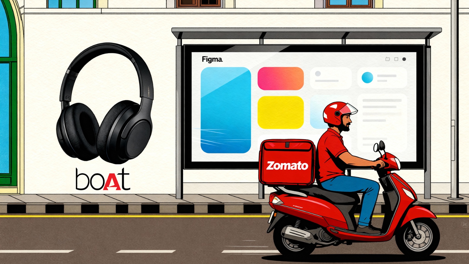
- boAt, which uses edgy colours, high contrast visuals, and bold typography to project a youthful, rebellious spirit.
- Figma, which uses minimalism and motion to tell a story of collaboration.
Zomato, which uses a bold red that signals speed, energy, and hunger, instantly recognisable across touchpoints.
Why Visual Storytelling Is the Heart of Modern Brand Building
1. Because customers do not just buy products; they want to live them
A brand identity is not a logo. It is a world a brand invites people into. Whether it is the pastel universe of Glossier or the earthy, handmade textures used by Indian craft-led brands like The Whole Truth Foods, design creates a universe that consumers slowly adopt as an extension of themselves.
Visual storytelling creates:
- Emotional belonging
- Recognition
- Memory
- Trust
- Desire
This is what makes a brand live in the customer’s mind.
2. Because people process visuals faster
Gestalt principles originate in psychology and show that the brain naturally organises visual details into coherent, meaningful forms instead of processing each part individually. This is why clear visuals, such as logos and infographics, communicate ideas quickly without large amounts of text.
Research suggests that humans process visuals far faster than text, which allows brands to communicate complex ideas quickly, such as:
- Innovation
- Sustainability
- Youthfulness
Because visual identity shapes credibility
According to HubSpot, nearly 50 per cent of consumers judge a brand’s credibility based on its design alone. This matters even more for startups, especially when they must create impact quickly while working with limited budgets.
Examples include:
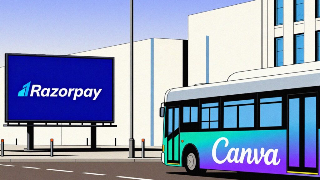
- Razorpay, which built trust in fintech through sharp geometry and a deep blue colour world.
- Canva, which grew globally by visually communicating simplicity in a category filled with complexity.
The Principles of Powerful Visual Storytelling in Brand Design
1. Authenticity
Design must reflect what the company genuinely delivers. Contradictions between promise and experience are quickly exposed online. Authentic visuals align product, service, and customer expectations.
Examples include:
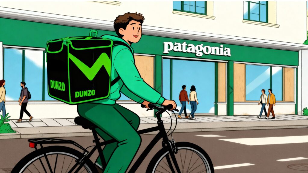
- Dunzo, whose quirky illustrations feel honest because their brand voice is playful.
- Patagonia, whose raw visuals feel authentic because sustainability is central to their identity.
2. Consistency
A brand becomes memorable through repetition. When typography, colour, iconography, photography style, and motion patterns are documented, the brand works reliably across teams and channels.
Think of the unmistakable nature of:
- Netflix red
- Cadbury purple
- Nykaa pink
- Swiggy orange
Consistency turns visuals into memory triggers.
3. Relevance
Visuals must be culturally and contextually relevant to the audience. A symbol that resonates with one group may alienate another. Testing and cultural nuance are essential.
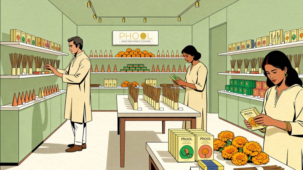
For example, Indian brands like Mati or Phool use Indian craft, art forms, and cultural references to shape perceptions of sustainability, authenticity, and heritage.
4. Simplicity
Although maximalism exists, minimalism continues to dominate because clarity outperforms ornamentation. Effective visuals remove noise and guide attention to what matters. Simpler design also scales better across formats.
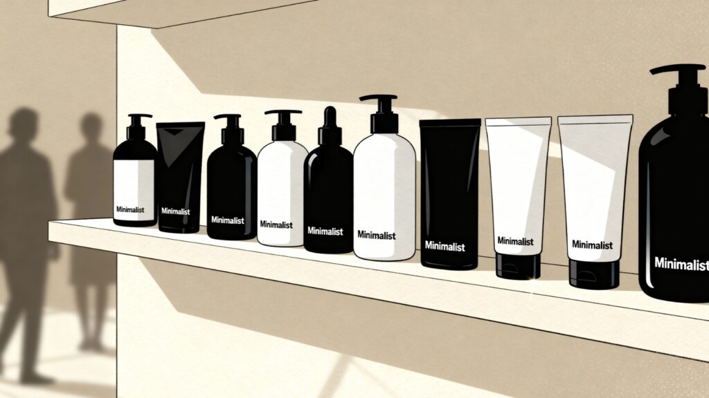
A strong example is Minimalist, a unique skincare brand, whose clean aesthetics, white palettes, bold and minimal fonts, continue to create a direct, credible identity.
5. Measurement
Design choices should be testable. A/B testing thumbnails, hero images, or short videos gives direct data on what improves click-through, time on site, and conversions
How Startups Can Use Visual Storytelling to Build Strong Brand Identities
1. Start with a clear brand narrative
Every design decision should answer:
- What world are we building?
- What emotion are we trying to evoke?
- What do we want customers to remember?
Design without narrative becomes decoration.
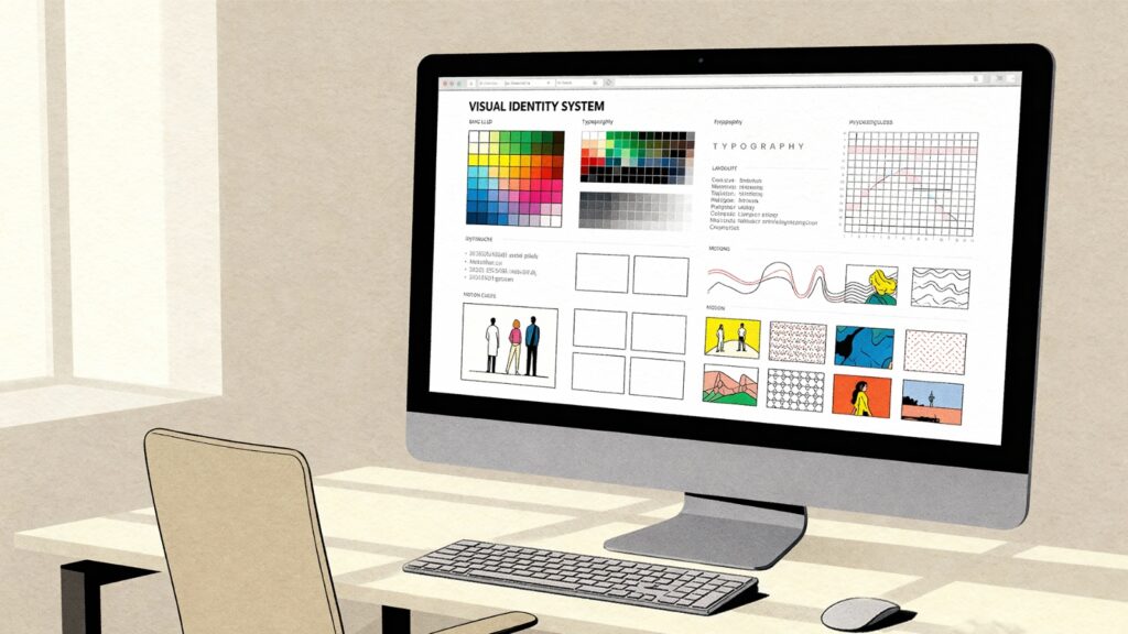
Build a visual system
A strong visual identity includes:
- Colour systems
- Typography rules
- Layout grids
- Patterns
- Illustration styles
- Motion guidelines
- Tone of imagery
This is how brands scale with consistency.
3. Keep it human
Metrics matter, but visual storytelling succeeds when it evokes emotion. A single image that sparks a memory, a short clip that makes someone smile, or a product shot that answers a question can build more loyalty than dozens of optimised but emotionless assets. For startups, this human thread becomes the differentiator.
4. Leverage motion, video, and micro interactions
Use short videos to explain benefits rather than features. Product demos or small customer stories reduce uncertainty and speed up decisions. Research shows that viewers rely on video to understand products, and many report being persuaded to buy after watching.
Micro animations, transitions, icon movements, and loading screens create delight. This is why brands like CRED or Swiggy Instamart feel premium and quick.
5. Tell stories across touchpoints
Build a modular visual system with components that can be recombined for social media, landing pages, packaging, and more. This reduces design debt and keeps the story coherent.
A startup’s visual story must remain consistent across:
- Website
- Packaging
- Social media
- App interface
- Retail space
- Advertising
- Customer service interactions
Great brands are not built on products alone.
They are built on meaning, emotion, and identity.
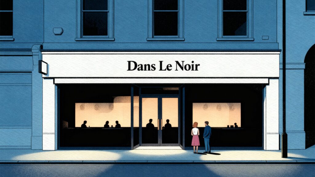
There is a restaurant in Farringdon, London, called Dans Le Noir. Diners walk into complete darkness and are guided by visually impaired staff. The experience creates a quiet role reversal. People taste food without the usual cues of plating, colour, and presentation. They realise how much the eye influences flavour and how enjoyment often begins before the first bite.
Visual identity works in a similar way. When a brand presents itself with clarity, intention, and a coherent world, perception shifts. People understand the story even before they read a line.
As a branding agency in Kolkata, we have seen this unfold for several memorable brands over twenty five years.
DOREME, a children’s clothing brand, uses a vibrant green that has become a signature shade symbolising youthfulness and freshness. Over time, the colour has become so recognisable that even without the logo or name, people associate the shade with the brand.
Prana Homes tells its story through a soft blue palette and gentle wave forms that evoke calm, renewal, and sustainability. This flowing element appears in their spaces, prints, and communication.
Every brand finds its voice through visual choices that evolve into a language. That language becomes the story the audience remembers.
If you want your own story to begin with a visual language that feels fresh, grounded, and unmistakably yours, let us create it together. Something crafted not just to see but to feel, and something your audience will continue to recognise long after it becomes part of their world.
Next Story
Top Web Design Trends to Watch in 2026
Jan 5, 2026
Long before brand guidelines, colour palettes, and Instagram grids existed, businesses relied on visual cues to communicate who they were. Ancient Roman wine bars hung vine leaves outside their doors…
Read More